ShmoopTube
Where Monty Python meets your 10th grade teacher.
Search Thousands of Shmoop Videos
Texas EOC Videos 540 videos
AP U.S. History 1.1 Period 5: 1848-1877. Which of the following groups would be most likely to support the idea of Manifest Destiny?
In the 1950s and 60s, people weren't just expressing their feelings toward the government—they were singing them, too. (Think Crosby, Stills, Nas...
Deal or no deal? FDR's New Deal provided hundreds of thousands of jobs in the public sector to bring the economy out of the Great Depression. It wa...
Suggestive Statistics 775 Views
Share It!
Description:
ACT Science: Data Representation Passage Drill 1, Problem 1. What do the statistics in Figure 1 suggest?
Transcript
- 00:03
A little birdie told us you wanted a shmoopy problem to solve... and we shall provide.
- 00:08
Included below in Figure 1 are some salary statistics by year from Major League Baseball.
- 00:14
Figure 1 suggests that... what?
- 00:18
And here's some potential answers...
- 00:23
What is the question asking?
Full Transcript
- 00:24
Basically, it just wants to know if we can interpret what it means when those bars in
- 00:28
the graph keep getting bigger and bigger...
- 00:31
Okay, so based on the graph, what do we know about the average player
- 00:35
salaries and the minimum wage?
- 00:37
Are they increasing, decreasing, or staying the same?
- 00:40
Well, they're definitely not staying the same. Otherwise, all of the bars would be
- 00:43
the same height.
- 00:45
The bars are getting taller year after year, so we can cross off option D.
- 00:49
Now let's check out the legend, or key of the graph.
- 00:53
The red parts of the bars indicate the average salary, and the green is the minimum wage
- 00:58
for the MLB. Very festive. Focus on the tiny green part on the bottom
- 01:02
of the graph... is it changing over time?
- 01:04
It sure is. It's getting higher... so we can get rid of option A that says only the
- 01:09
AVERAGE wage is getting higher, not the minimum wage.
- 01:12
Next, the red part of the graph. Is it getting higher over time?
- 01:17
Yup, the red part is definitely increasing. So option B is our answer.
- 01:21
Both the average wage and the minimum wage increase over time.
- 01:25
And good thing, too. Considering how bad inflation is.
Related Videos
ACT Science: Research Summary Passage Drill 2, Problem 1. Why do you think that the filter paper will not remove the salt from the water?
ACT Science: Conflicting Viewpoint Passage Drill 1, Problem 1. What statement would both scientists agree upon?
ACT Science: Data Representation Passage Drill 1, Problem 2. Which of the following is a variable in Figure 1, but not in Figure 2?
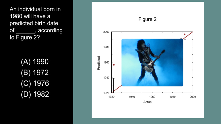
ACT Science Data Representation Passage: Drill 3, Problem 5. According to Figure 2, what birth date will be predicted for an individual actual...
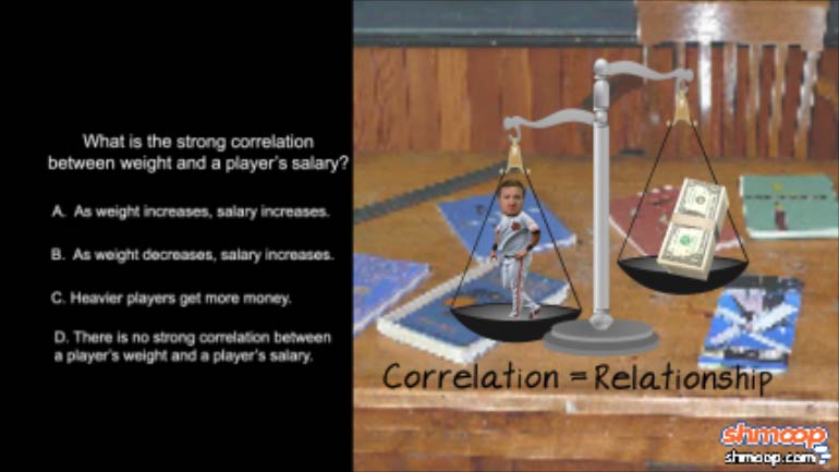
ACT Science: Data Representation Passage Drill 1, Problem 3. What is the strong correlation between weight and a player's salary?

